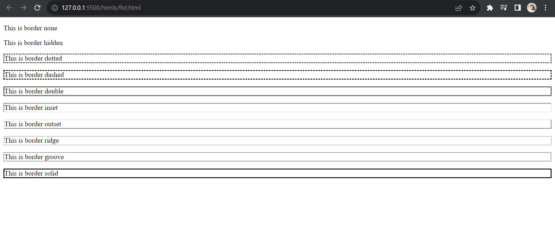
Border property helps in creating borders around the text. Various properties in it are discussed in this module.
<!DOCTYPE html>
<html lang="en">
<head>
    <meta charset="UTF-8">
    <meta name="viewport" content="width=device-width, initial-scale=1.0">
    <title>Different type of Borders</title>
    <style>
        p.none {border-style: none;}
        p.hidden {border-style: hidden;}
        p.dotted {border-style: dotted;}
        p.dashed {border-style: dashed;}
        p.double {border-style: double;}
        p.inset {border-style: inset;}
        p.outset {border-style: outset;}
        p.ridge {border-style: ridge;}
        p.groove {border-style: groove;}
        p.solid {border-style: solid;}
    </style>
</head>
<body>
    <p class="none">This is border none</p>
    <p class="hidden">This is border hidden</p>
    <p class="dotted">This is border dotted</p>
    <p class="dashed">This is border dashed</p>
    <p class="double">This is border double</p>
    <p class="inset">This is border inset</p>
    <p class="outset">This is border outset</p>
    <p class="ridge">This is border ridge</p>
    <p class="groove">This is border groove</p>
    <p class="solid">This is border solid</p>
</body>
</html>
Output

It sets the width of the border in pixels (or there are key values too like medium, thin, thick)
Example :-
<style>
    border-style: solid;
    border-width: thin;
</style>
Output

You can assign values according to your wish or use medium/thick instead of thin if you wish to.
This property assigns colours to the border of the text. We’ve already discussed in the CSS colours module different ways to provide the colour value like rgb, hsl, etc.
Example :-
<style>
    border-style: solid;
    border-color: #f23;
    padding: 20px;
</style>
Output

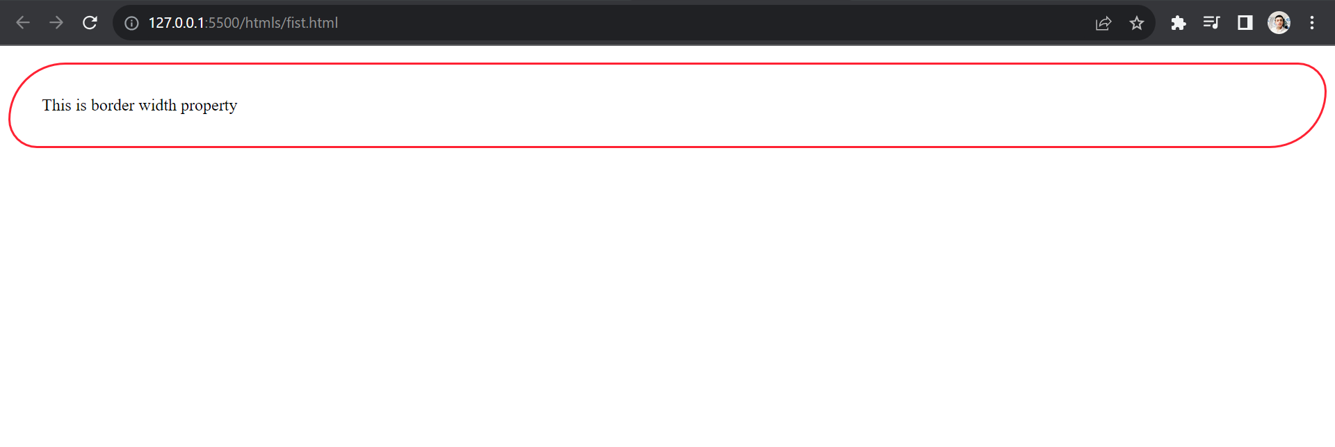
Rounded borders around buttons look classic, which can be achieved by border-radius property.
Example :-
<style>
    border-style: solid;
    border-color: #f23;
    border-radius: 30px;
    padding: 20px;
</style>
Output

In this example, we gave a single value to the property; but if you want to choose for each edge you can provide two values, three values and four values which resemble the top-left corner, top-right corner, bottom-left corner, and bottom-right corner.
Apart from that, you can control the outer radii as well using “%” or em (relative font size unit in CSS, we’ll discuss it later in depth).
Example :-
<style>
    border-style: solid;
    border-radius:20rem 10rem;
</style>

CSS has these two properties too, to help the user select the spacing between two borders but before you go testing them, this property requires a table.
Which of course we’ll look at later. For now, you can know the syntax of both properties.
Example :-
<style>
    border-collapse: value;
    border-spacing: value;
</style>
Just like background shorthands, there exists a border shorthand which takes three properties: width, style and colour.
Example:
<style>
    border: solid red 10px;
</style>
